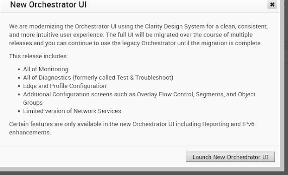
SD-WAN and the new GUI (Angular UI): Is it really better ?
Since version 4.0 VMware is working on the new (Angular)UI and still in version 5.0.0.x only parts have been converted up to now.
I think now it is time to look and compare, but also see where there are still weaknesses in the new UI.
One meaningful enhancement is the possibility to also see under PATHS the existing Overlay Tunnels from that device
Unfortunately it takes some time until new paths are visible here and for some time you do not see any usageIt is very complicated to get actual information out of that graphics as it seems that they are updates only every 5 minutes
The above picture was taken at
... and it seems, that this tunnel close at 10:03, which is not the case, it is still running.
I completely understand, that for bigger SD-WAN networks it is impossible to have up-to-date information ready immediately, but I would expect to have a similar live view for an overlay path or for all overlay paths, like you get on the underlay, or at least an actual path state information
Another enhancement is that in Remote Diagnostics the screen is now better adapted to the available window which helps and prevents unnecessary horizontal scrolling.
But any display containing IPv6 addresses need to be reworked as this is not a nice view.
Lines in a table should have the same cell length otherwise you have a weird picture.
And it is completely unusual to display IPv6 netmask in that way, instead of using the "/#masklen#" format
Regarding configuration, it is not easy to detect if a specific feature can be configured in the new or in the old or in both UIs
It is sometimes annoying if for the same feature, depending if you want to add ipv4 or ipv6 you need to go to either old or new UI.
- For Edges typically all IPv6 you need to use the new UI
- For Gateways all configuration including IPv6 is only in the old UI.
So I hope that the migration will be finished soon, it makes the monitoring, debugging and configuration easier, when you have a single consistent UI.
PS: similar transition taking too long is the topic on API, were we still have a V1 and a V2 with different features each.


Hi Alexander,
ReplyDeletethe new UI is, as you mentioned, way better on higher resolution displays.
But there seem to be still some bugs and one is really interesting.
If you go to the configuration section of a VCE and sort the elements by "segment aware", you are not able to do a override on a interface of a VCE. And to make it even worse, toggling the override button does something else (which you can see in the grayed out background window): it toggles the Cloud security service button....
Since I saw that Vladimir keeps reading here...whom can I contact with my finding? :)
Stephan
Unfortunately even I still have no real contact to signal bugs or behaviour problems, so maybe by making the public here, someone will forward those concerns to relevant people within the SD-Wan or SASE group. At least that is my hope. Regards Alexander
Delete